Lots of users
56.7 million Americans have some type of disability (1), and 22.5 million adult Americans reported having some type of visual impairment (2). Most people experience some amount of vision and hearing loss as they age, and it is not uncommon to lose some cognitive abilities as well. This means there’s a good chance someone with a disability will visit your site or use your product.
You don’t have to be perfect
The best thing you can do when designing a website is to keep accessibility in mind and try to accommodate people with disabilities. The W3C Web Content Accessibility Guidelines (WCAG) offers three levels of conformance: A, AA, and AAA. WCAG points out that getting to AAA level for an entire site is not recommended and often not possible. Getting to A level is a great place to start and will allow millions of people to have a more positive experience with your product. Every step you take towards getting to the next level of conformance will make the experience that much easier and better for more and more people. Achieving A and AA levels shouldn’t hurt the visual design or brand of your website or product.
Where to start
Create inclusive personas
To help keep accessibility in your conversations and designs, give one of your personas a disability. Make them blind or low vision, deaf, or limited mobility (particularly with their hands). This will help keep your product accessible from the beginning.
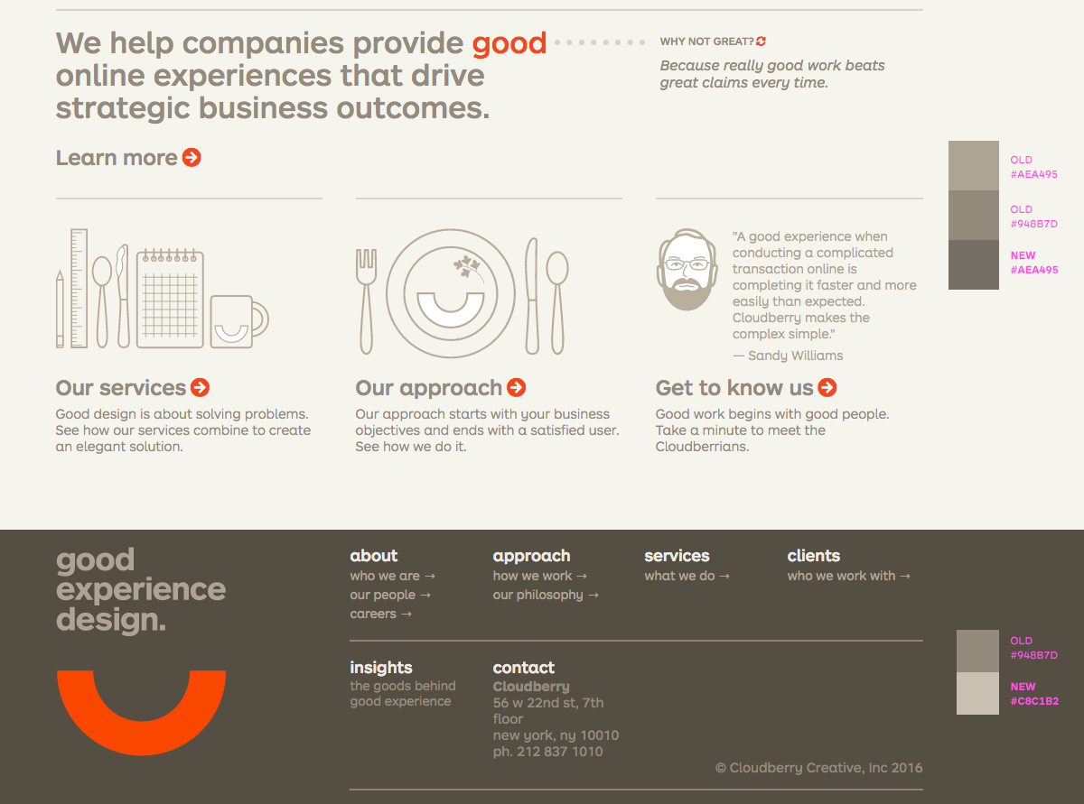
Use of color
Color can be a good tool to draw a user’s attention, but it’s important to not use color as your only method of communication. This helps colorblind people, people with low vision who need higher contrast, and blind people. For example, when creating forms, include an icon or some text when presenting an error state, don’t just outline the form field in red. Also, keep contrast in mind when choosing colors. If the contrast between text and the background is too low, many people will have a hard time reading the content. Contrast checker tool.
Consider “skip navigation” links
If your site has a long navigation on every page it can be very cumbersome to use for people with certain disabilities. Consider a person who has limited use of their hands, or someone using a screen reader. They have to rely on the tab key to get to the middle or bottom of the page. This could mean 25, 40, or sometimes even 100 clicks before they are actually at the content area of any given page. Adding an anchor link (it can be hidden) at the top of the page that takes the user below the navigation to the content of the page can make a big difference in the experience for that person.
Include a person with a disability in your user testing
The best way to confirm that your site will work for people with disabilities is…to test it with people with disabilities! Having someone who is blind, or uses assistive technology use your site early on can help pinpoint areas to improve.
Practicing what we preach
Before writing this blog post, I did an accessibility audit of Cloudberry’s website and found the contrast ratios for some of our text did not meet the minimum standard for AA compliance. Working with our visual designers and developers we quickly altered the color palette enough to meet the AA standard.