
10 Accessibility Principles Backed by Behavioral Science
When you align your product with real-world cognitive and physical needs, you unlock experiences that are clearer, easier, and more inclusive by default.
Below are 10 key principles from the Web Content Accessibility Guidelines (WCAG) that we believe are a smart place to start. While not a comprehensive checklist, these ideas can meaningfully improve both accessibility and overall usability—making your digital experience better for everyone. Want to read more about accessibility? Read our posts on Inclusive Design and Accessible Design.
The First Principle of Accessibility: Perceivable
Information and user interface components must be presentable to users in ways they can perceive.
1. Provide text alternatives
All non-text content has a text alternative available to all users.
1.1.1 Non-text Content — Level A
People process information in different ways. Text alternatives (like alt tags for images or subtitles for videos) not only help users who are blind or hard of hearing, but also those who may be watching videos in a noisy café. From a behavioral science perspective, this reduces cognitive load and supports dual coding theory.
Example
Providing alt tags for images, subtitles for videos, or tables with data for charts.
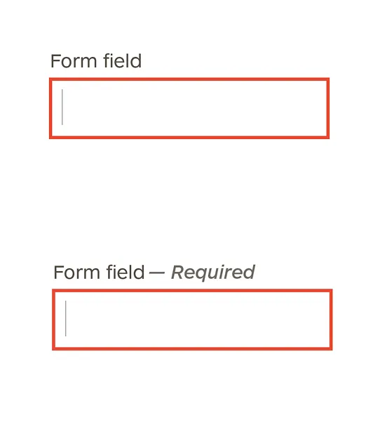
2. Don’t rely on color alone
Color is not the only way your designs convey information, indicate an action, prompt a response, or distinguish a visual element.
1.4.1 Use of Color — Level A
People miss visual cues for all kinds of reasons (color blindness, glare, low-quality screens). Designing with redundant cues (like labels, icons, or textures) respects user diversity and supports error prevention, a key principle of both behavioral and accessible design.
Example
Form fields in error state that are highlighted in red have accompanying text stating the error. A pie chart uses labels with lines connecting each label to its section.
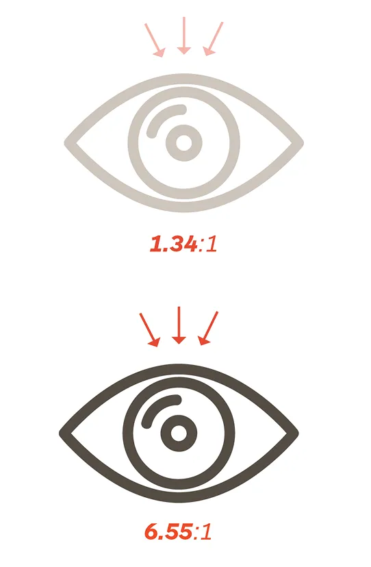
3. Ensure adequate color contrast
The colors of text and the background of text have a contrast ratio of at least 4.5.
1.
1.4.3 Contrast (Minimum) — Level AA
High contrast isn’t just about aesthetics—it’s about reducing eye strain and improving readability. Better contrast lowers friction and supports fluency, which makes users more likely to stay engaged and perceive your content as credible.
Tip
You can use this tool to check the contrast between your text and background.
4. Avoid images of text
When technically feasible, do not have text in images.
1.4.5 Images of Text — Level AA
Text embedded in images can’t be resized, copied, or interpreted by screen readers. When information is presented as actual text, it’s more accessible and adaptable. It also supports control and choice architecture. This gives users more flexibility in how they consume content.
Example
Instead of an image file for a button, use CSS and HTML for color and text.
The Second Principle of Accessibility: Operable
User interface components and navigation must be operable.
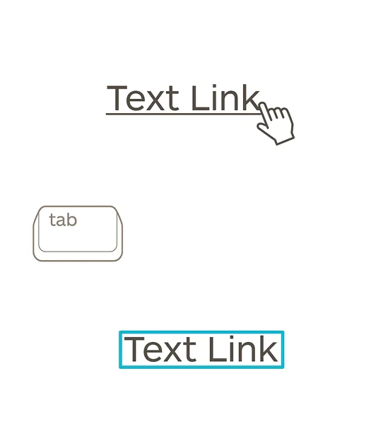
5. Make it keyboard friendly
All functionality and interactions can be performed with just a keyboard (no mouse required).
2.1.1 Keyboard — Level A & 2.1.2 No Keyboard Trap — Level A
Many users, including those with motor impairments or temporary injuries, rely on keyboards instead of mice. Designing for keyboard access aligns with behavioral science principles to minimize effort and supports a wider range of abilities. If something is hard to do, people avoid it. If it’s easy, they engage.
Example
An application that uses drag and drop also supports “cut” and “paste” or form controls to move objects. If you tab into an app or modal, there should be a clear way to get back to the main experience from the keyboard.
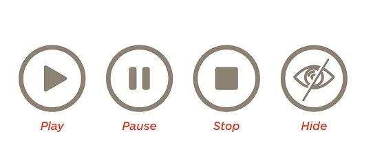
6. Give users control over moving elements
For moving, blinking, scrolling, or auto-updating information, there are controls that allow the user to pause, stop, hide or control the content.
2.2.2 Pause, Stop, Hide — Level A
Animations and auto-play elements can cause cognitive overload or even physical distress for some users. Giving users control over these elements supports autonomy and reduces distraction.
Example
A stock ticker has “pause” and “restart” buttons, an animation runs in the upper portion of the page but has a “freeze animation” button near the bottom of the animation.
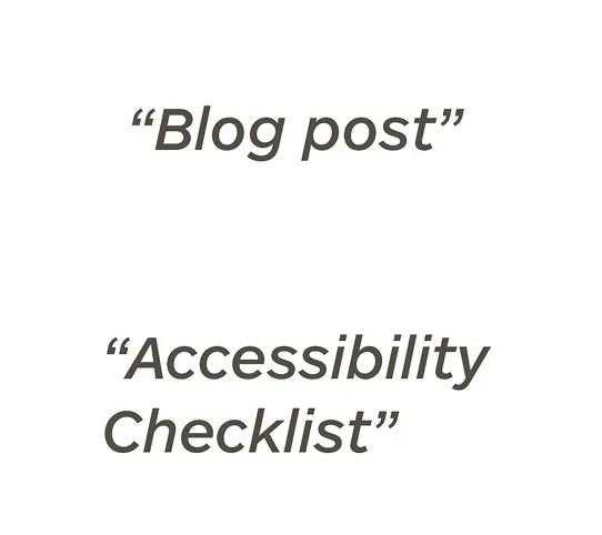
7. Use descriptive page titles
Web pages should have titles that explain the subject of the page, make sense out of context, and are as short as possible.
2.4.2 Page Titled — Level A
Clear, informative titles act as signposts. They support mental models and help users build a coherent picture of where they are on the page and what to expect next, reducing ambiguity and improving navigational confidence.
Example
Instead of using a generic page title, such as, “Blog post,” use a descriptive title related to the content – “Accessibility Checklist.”
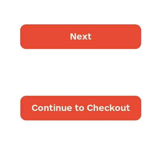
8. Make links and buttons descriptive
Button labels and link copy, including copy around the link, should let users know what happens when clicked.
2.4.4 Link Purpose (In Context) — Level A
Labels like “Click Here” or “Next” offer no context for what will happen. Descriptive calls to action support predictability, which is crucial in shaping user behavior and reducing drop-off.
Example
Instead of a button labeled “next” it says “continue to checkout”
9. Use clear headings and labels
Headings and labels describe the topic or purpose of the content or component.
2.4.6 Headings and Labels — Level AA
People don’t read—they scan. Well-organized headings and intuitive labels reduce perceived choices and streamline decision-making. It is also particularly useful for people who process information slower or have limited short term memory.
Example
Form fields are consistently labeled describing what the user should enter in the field, sections of a web page should be formatted as a header and let the user know what they will find in each section.
The Third Principle of Accessibility: Understandable
Information and the operation of user interface must be understandable.
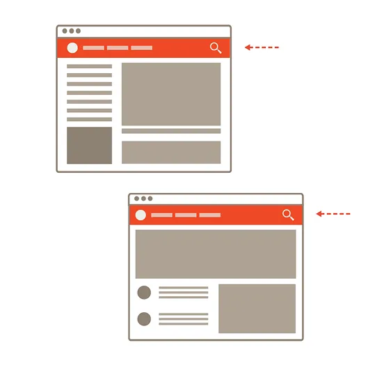
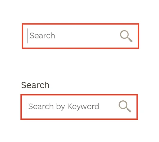
10. Keep navigation consistent
Navigational components should appear in the same order and in the same place on all pages.
3.2.3 Consistent Navigation — Level AA
When navigation shifts across pages, it creates confusion and increases cognitive load. Predictable navigation reduces mental effort and builds trust, tapping into the principle of least astonishment. Familiarity encourages deeper engagement and habit formation.
Example
If there is a search icon in the upper right corner of the navigation on the home page, it should be there on all pages in the site.