
Designing for Conversations, Not Clicks
In a world shaped by Siri, ChatGPT, and voice commands, users expect your interface to listen, understand, and respond instantly—not make them dig.
With the expansion of voice assistants, chatbots, and AI-powered interfaces like Siri, Alexa, and ChatGPT, it’s clear that conversational interfaces are not just a trend—they’re a transformation. That shift presents both a challenge and an opportunity: how can we design traditional digital experiences with this “chat-first” mentality in mind?
While your business may not be building a chatbot just yet, you can still apply behavioral insights and design strategies that power great conversational experiences.
So, what are some practical chat-first principles we can apply to browser-based interfaces?
Prioritize content strategy
When successful, bots answer our requests by providing exactly what we are seeking, no more, no less. On top of that, they reply with the right amount of gravity – or levity – that feels in sync with the subject matter. For websites, this exact same logic should be applied when communicating content like instructions, error messages, features and customer service. While web content is predominantly written by humans, sometimes it feels like it was not written for humans. We need to put as much effort into our UX writing as we do into making chatbots feel natural.
Is this possible for sensitive topics like finance and health? Definitely. On their secure web experience, Simple Bank does a great job balancing concise but thorough answers with an appropriate voice and tone. Without using footnotes or an FAQ to back it up, they are able to answer all pressing questions around a potentially serious issue like blocking your debit card. And they are doing so in a tone that is extremely reassuring.
Emphasize search over navigation
Like Conversational UIs, which have no idea what users will ask next, websites can similarly make the assumption that, for the most part, users are coming to their site with very clear intentions. To prepare for specific requests, sites should refrain from revealing their entire catalogue (and digital noise) and instead offer ample space for users to start the conversation.

Online, you can currently see this strategy implemented nicely by GE.com. Despite operating countless business units, GE’s landing page is impressively restrained. The primary nav is limited to four items and search, highlighted by a “What can we help you with?” CTA that takes center stage. Popular search items are then presented as a subtle method of promotion. The structure of this page is not a far leap from what Alexa might resemble if manifested on a screen. As a user, the site gives total control to explore on your own terms.
The key to achieving this model is creating a search system that is capable of ingesting more flexible requests from its users. Website search needs to listen and react to how humans naturally ask.
Allow for progressive disclosure
Think of how conversational UIs reveal small bits of information, then expand or adapt based on what the user wants to know next. This structure isn’t just elegant—it mirrors how the brain prefers to process and retain information. Progressive disclosure is particularly helpful for dense educational content where lots of information needs to be processed.
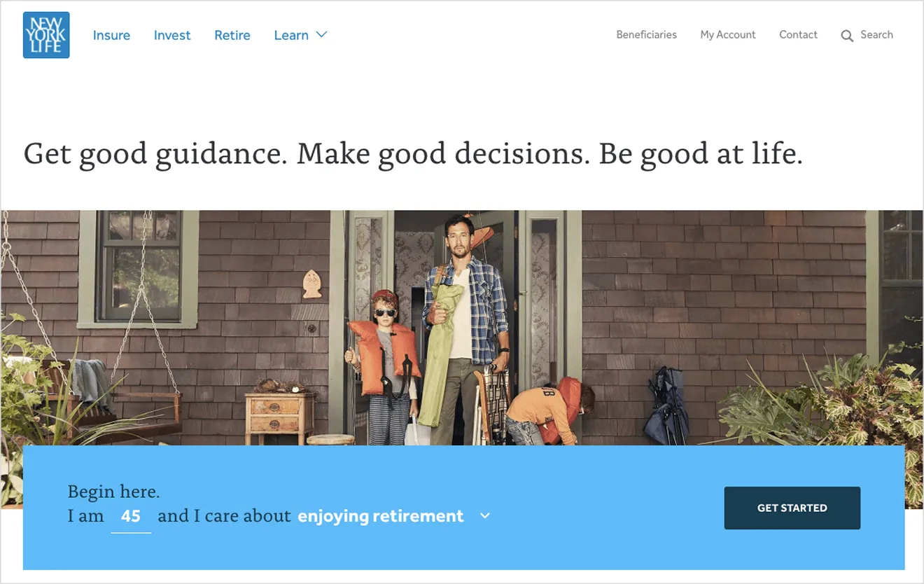
With their recent redesign, NewYorkLife.com (much like GE) greatly reduced the option to navigate across products and instead utilized a goal-oriented messaging strategy to onboard the user into their appropriate product line. They guide users through a simple question flow like “I am 45 and want to enjoy retirement.” The interface then responds with tailored recommendations, deepening the interaction only when the user signals readiness. This dialogue, which gradually reveals the right solution via personal motivations, entirely replicates one of the core fundamentals of Conversational UI. It’s not just personalization, it’s partnership.
While creating a chatbot application may not be feasible for your organization, consider redesigning certain sections of your website with a chat-first mentality.
Where are some areas to focus first?
- Audit your microcopy. Is your tone aligned with the emotional weight of the subject matter? Is it direct, trustworthy, and helpful?
- When first bringing users into your experience, onboard them in a way that makes them feel empowered rather than overwhelmed.
- Lighten the cognitive load. When presenting complex topics to users, refrain from components such as comparison charts or mega menus. Instead, leans towards progressively disclosing information dynamic to the user’s preference.
Imagine your current digital experience as a voice app. What would it need to change? Would you use different words? Offer fewer options? Structure the flow differently? Designing with conversational mental models leads to more user-centric outcomes. You don’t have to predict every path—just be ready to respond with clarity and care. Do these insights bring inspiration to your current website? We’d love to hear your thoughts.